Building a Lean Design System to Scale Design
Overview I was the only designer for 50 backend engineers, making me a constant bottleneck. So I created Stardust, a scrappy design system that enabled me to scale design within the team.
Impact Grew from 1 to 20+ components in ~18 months, outpacing Bootstrap adoption within 3 months and reaching ~80% codebase coverage, used by all 8 scrum teams — enabling backend engineers to ship UIs independently for a platform with 1,300+ active users.
When I started on Adobe’s internal developer platform team, I was the first and only designer and frontend developer. The rest of the org was ~50 backend and systems engineers across many scrum teams. The imbalance created a constant tension: teams were either blocked waiting for me, or they were hacking together their own UIs with copy-pasted Bootstrap and custom CSS. Either way, the results weren’t great.
The platform itself was called Ethos, Adobe’s internal CI/CD and service management system for engineering teams across the company. Most developers interacted with it through Moonbeam, the primary UI tool for building, deploying, and monitoring services. By 2018, Moonbeam had over 1,300 active users, 1,000+ production services, and 38,000 successful deploys in a single year.
The Problem
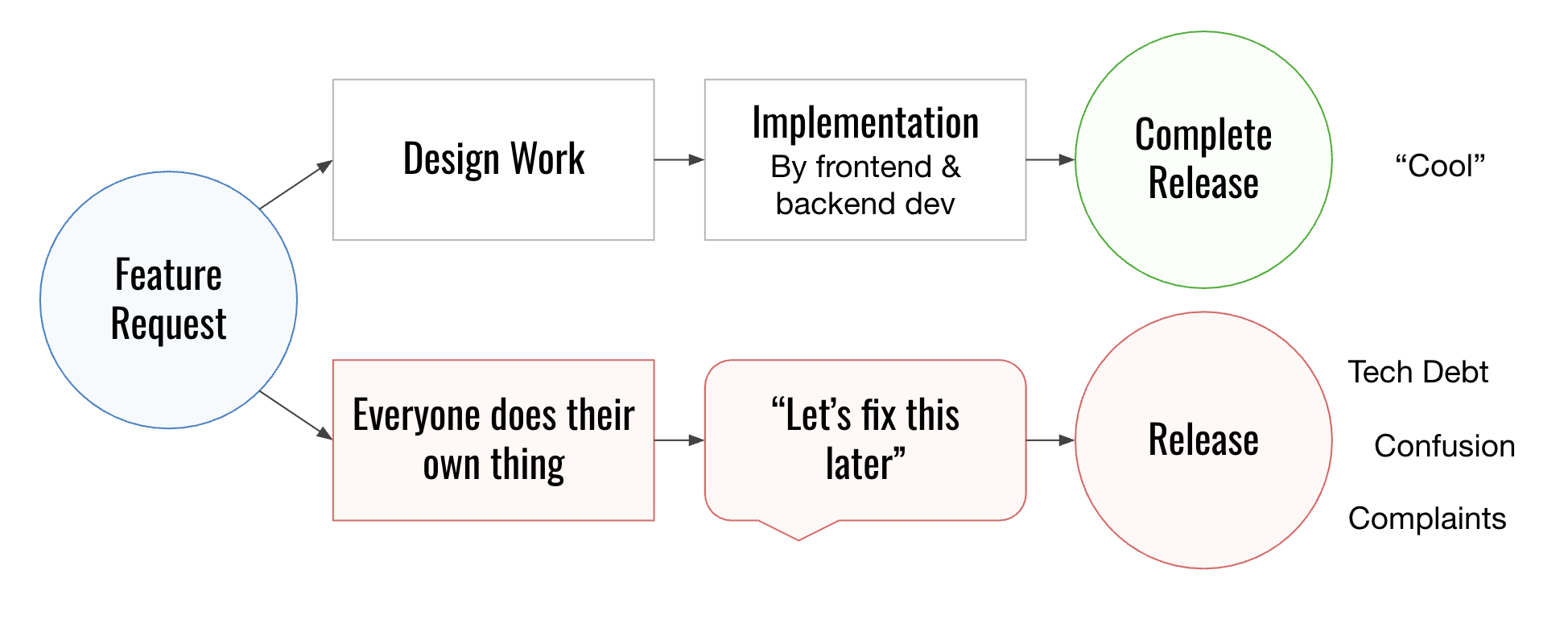
My feature development lifecycle had two paths. In the best case scenario, a scrum team would come to me, I’d do the design work, and the UI would ship looking and feeling right. That happened maybe 20% of the time.
The other 80%, teams would do their own thing. They’d skip the design phase, hack together a UI, call it good enough to ship, and log a Jira ticket to “fix it later.” And later never came. The result was a product made up of four separate web apps, each with its own login page, its own inconsistent element styles, its own take on every component. Users even had to log in four separate times just to use all of the necessary apps for their jobs.
I was a bottleneck, and that wasn’t good for anyone. I wasn’t proud of the UIs going out the door, and neither were the developers. Other teams were frustrated being blocked. And I was burning out trying to be everywhere at once.
The Turning Point
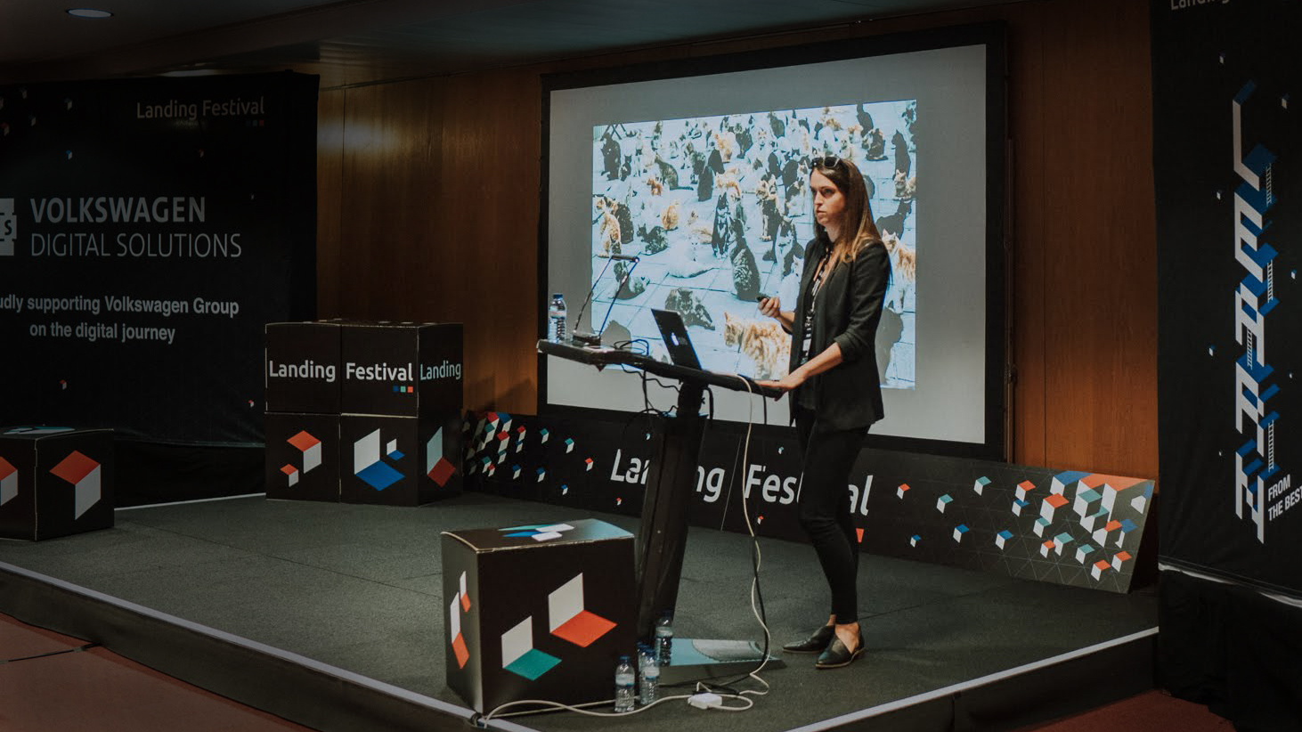
In 2017, I attended CSS Dev Conf in New Orleans. Mina Markham gave a talk about Pantsuit, the design system she built for Hillary Clinton’s presidential campaign and one of the first design systems to be widely discussed in the industry. It clicked immediately: a design system could scale my work and increase UI consistency. I could use it to let other developers contribute to the frontend without needing deep frontend expertise.
I left that conference with a plan. Rather than trying to control everything myself or waiting until I had more headcount, I could create building blocks that anyone on the team could use.
I brought the idea to leadership, framed around the problems I was already living with:
- Scale the impact of frontend work: Build once, use everywhere
- Stop duplicating work: Solve hard problems like accessibility and responsiveness once, per component
- Create consistent user experiences: Stop the copy and paste chaos
- Democratize UI development: Any developer, regardless of expertise, could contribute a solid UI
Leadership signed off, and I kicked off Stardust.
Building Stardust
I named it Stardust because it would be sprinkled across every product on the platform. It also aligned with all of our other space-themed products. My strategy was an iterative approach: start small, prove the value, build momentum.
Principles & guidelines
Before writing code, I made some key decisions that would be hard to change once I got started. I adopted BEM (Block-Element-Modifier) methodology for CSS naming because it made code easier to understand and reduced the risk of styles overlapping across components. I decided to start with just six components, the ones that appeared across every view in every product.
I also introduced a CSS namespace, rf- (for “refactored”), as a prefix on all new design system classes. This let me track adoption visually: the snippet of CSS below could outline every element that had been migrated to the new system in bright purple. It became a surprisingly effective visual way to show progress to stakeholders.
[class^="rf-"],
[class*=" rf-"] {
  outline: 2px solid #ff00ff;
}
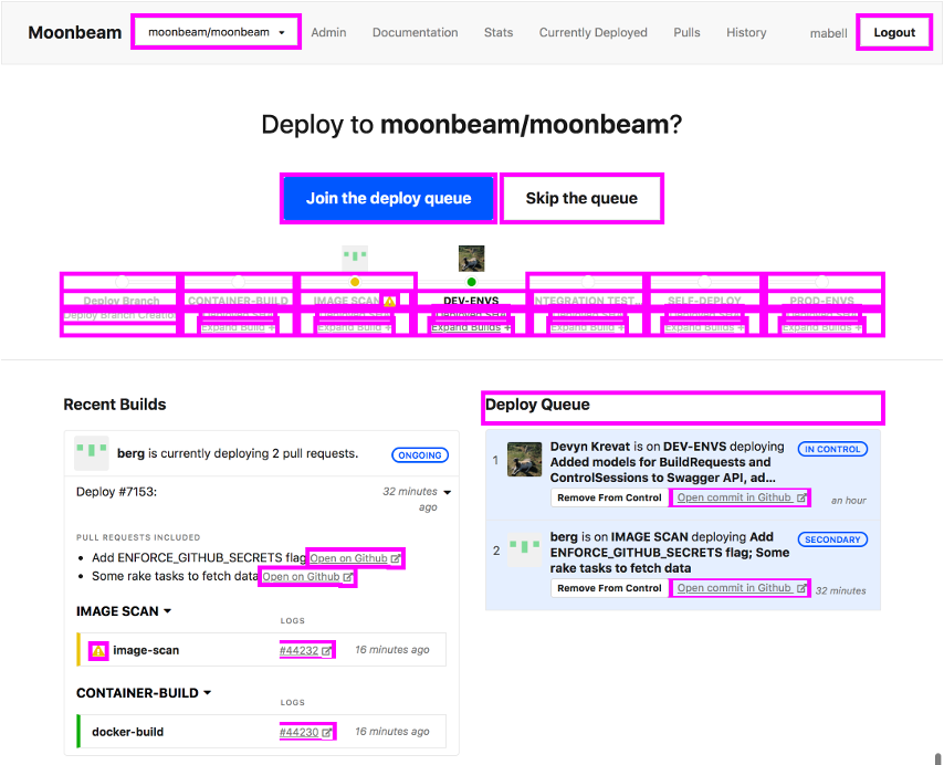
rf- namespace in action: every element migrated to Stardust outlined in bright purple, making coverage visible at a glanceUI toolkit
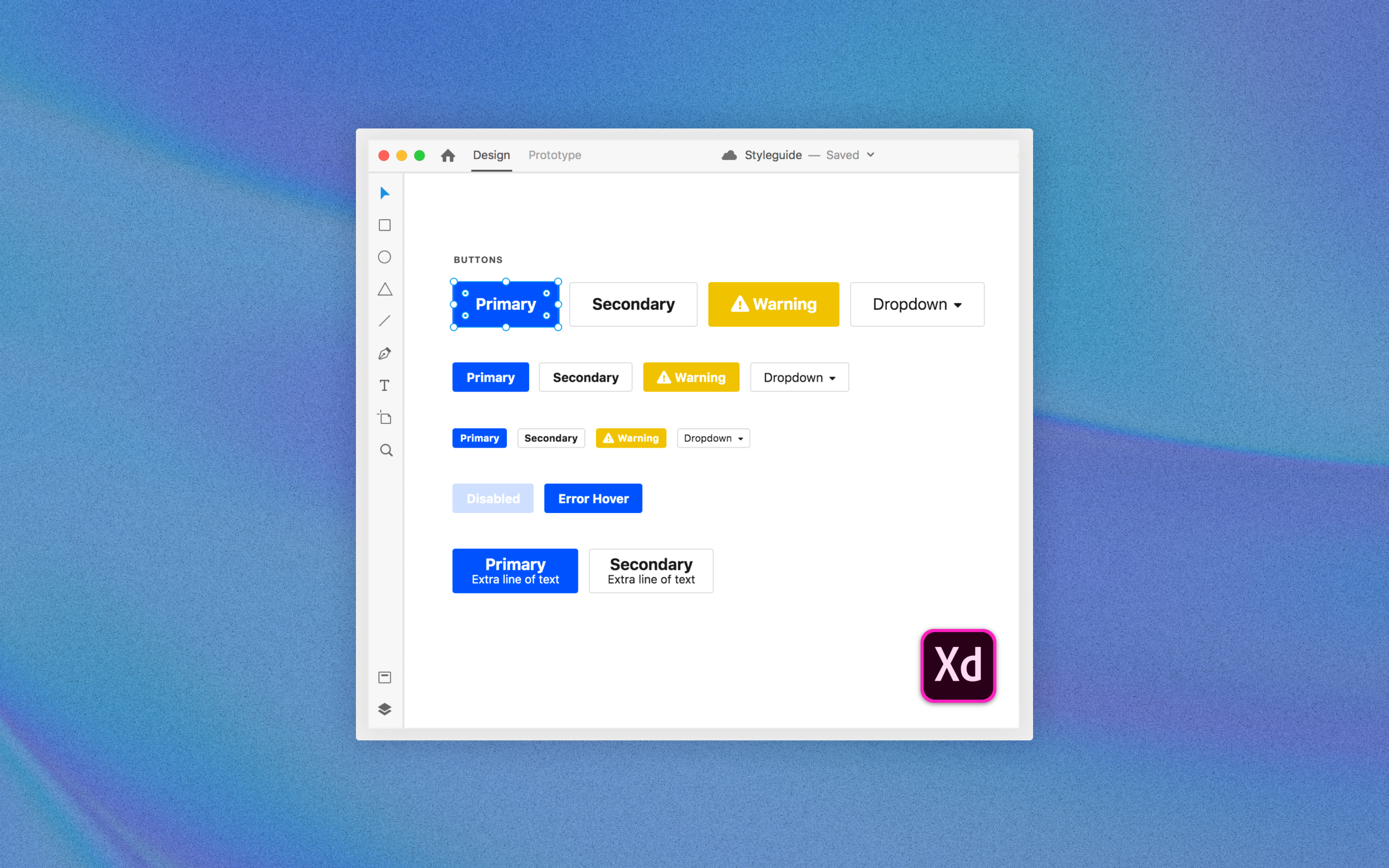
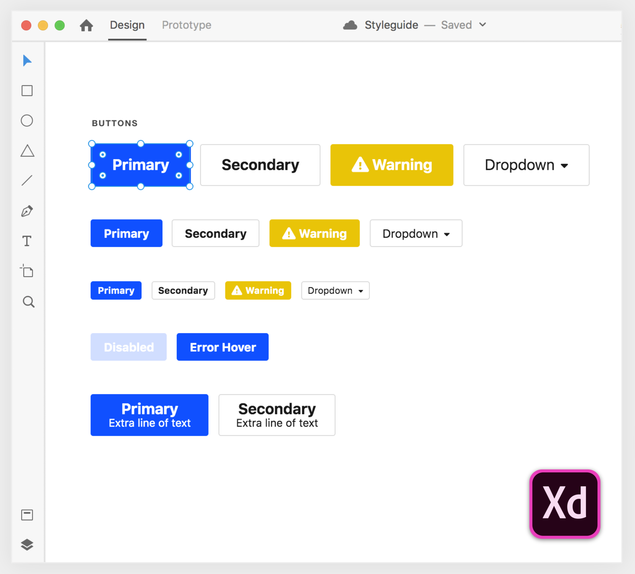
I audited the existing products to identify the components that kept showing up. Buttons, form elements, navigation, tables, etc. I documented every variation: size, state, color, context. Then I built design files in Sketch for each component, plus a single comprehensive file showing the full component library at a glance.
I made the files available immediately via a shared folder, linked from the codebase readme. Making things accessible early was a principle from the start. The sooner people could use the system, the sooner it could prove its value.
Coded Components
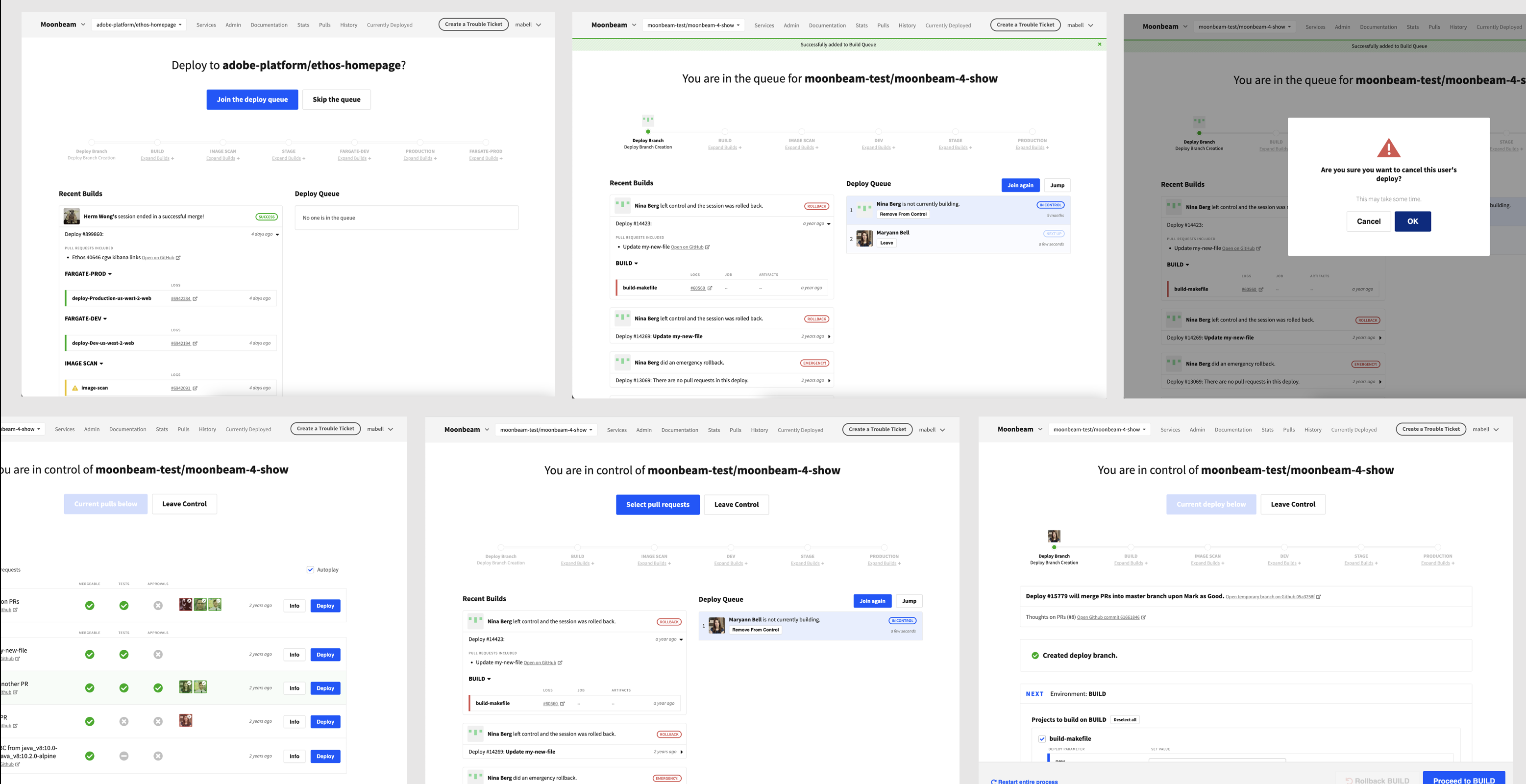
I then built CSS and HTML files for each component, pulling heavily from the existing codebase. The compiled CSS was hosted on a CDN so any developer could add a single <link> tag to their HTML and have the full design system available within minutes. No complex setup and no new dependencies.
My first component was the button. It sounds simple, but it was the single element that appeared in every product, in every view. It also had the most variation and inconsistency across the codebase. Getting that one right was the proof of concept.
Documentation & distribution
I built a custom PHP documentation site in an afternoon to showcase the components. It wasn’t fancy — it showed the rendered component, the code to produce it, and its variations. But it was live and shareable immediately. I sent the link to anyone interested in contributing a UI.
Building the system was only half the work. After I made it, I had to get people to use it along with me. So, I also ran:
- A dedicated Slack channel where anyone could ask questions
- Training sessions walking developers from concept to completion using the system
- 1:1 screenshares with teams working on new UIs, which helped build relationships across scrum teams
- Office hours for ongoing questions
The shift I was trying to make wasn’t just technical. I was asking 50 backend engineers to think about frontend work differently, to see it as something they could own, not just something they requested. That took time and repetition.
Outcomes
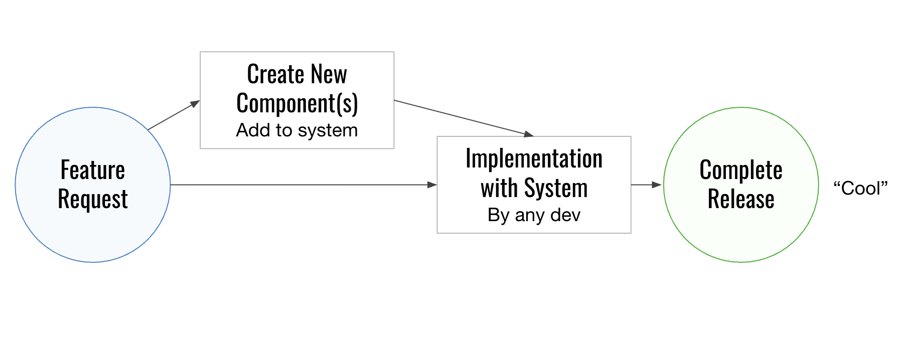
The change in the feature development lifecycle was significant. Rather than the two-path problem (wait for frontend or ship something broken), there was now one path: implement with Stardust and ship with confidence.
Stardust started with a single component, the button, and grew to 20+ over the next year and a half. Within three months of launch, it was outpacing Bootstrap across the codebase, eventually reaching roughly 80% coverage before we pivoted to Spectrum (a story for another case study). All eight scrum teams in the org had access from the start, and backend teams began contributing their own UIs quickly. Time-to-ship got faster and visual consistency across the platform improved, something users noticed and commented on.
The most meaningful signal was that backend engineers were designing and shipping UIs on their own without being blocked on me.
Lessons Learned
Every decision has a shelf life, and the ones I made in 2017 were right for 2017. But with hindsight:
- Build community in parallel, not after: I spent too long building the system before making it available. The adoption and teaching should start the moment the first component exists.
- Track more, even when moving fast: Code coverage was the primary metric my manager cared about, and it was a good one, but I wish I’d been more rigorous about measuring other things: time-to-ship, adoption rate, UI issues filed. We were moving quickly and measurement wasn’t the priority, but having those numbers now would tell a clearer story.
The biggest thing I took from this work wasn’t technical. It was about mindset. Everyone wants to do good work that looks good and that people enjoy using. The key is to find a way to help them do that rather than trying to control every piece of the design process.