Ringlet’s Design System: A Strategy for Startups
Overview As a fractional design leader, I have limited capacity. So I built a lean design system that enables the team to create and ship UIs on their own. This design system can now also be given to AI design tools as context. Using designs and wireframes we'd already collaborated on for MVP, I built Rizzlet, a Figma-based design system.
Impact The founding team has been building UIs almost entirely on their own for years, with minimal updates needed. All new features start using elements from the design system. The team has also been able to accelerate by using the system as context for AI tools, generating new design concepts from a solid UI foundation.
The Problem
Ringlet is an early-stage, bootstrapped startup with a small founding team. As their Head of Design, I’m not there full-time, which means I can easily become a bottleneck. Every feature waiting on a design decision or artifact is a feature not shipping to the users. Keeping design expertise limited to one team member also reduces the capacity and empowerment of the rest of the team.
We had launched the MVP, and we started working on several new features at once, eager to get our fast follow-ups out the door. In the rush, design decisions get made ad hoc, consistency slips, and debt accumulates. I’d already seen this a bit: I did a quick design audit of our existing artifacts and code, and we had five different versions of the same dark purple across the product. If I didn’t create structure, it would only get harder to stay consistent. I also wanted to have all of the tokens and components I was using in one place for my own workflow efficiency.
Goals
- Create a useful MVP design system to make design easier for myself and the founding team.
- Empower founders and developers to create designs on their own without learning Figma.
- Make the system extensible for easy additions so that we can build it on the fly, just like everything else.
- Complete in a single sprint; timebox to ensure laser-focus on including the elements that would be used most and save the most time.
Strategy
Include objects as part of the design system. We’d done a lot of thinking around the objects in our system as part of the MVP launch. I wanted the design system to reflect those objects, not just the elements that make up the objects.
Build on what already exists. We already had plenty of designs with useful elements. We just needed to gather them, create components and variants, and finesse any inconsistencies.
Design for copy and paste, not Figma expertise. The founding team are developers and founders, not designers. So I designed the system so they could copy existing components and modify the content. That’s why each object page includes many pre-made instances of variants — so the team didn’t have to figure out the finer points of Figma.
Building Rizzlet
These three principles together shaped what Rizzlet became. The answer was a very lean design system. Rather than a large, perfectly documented enterprise system, I focused on the right set of building blocks to let the founding team make good design decisions without me in the room. The result is Rizzlet, Ringlet’s design system.
When is too early?
I’ve been asked this question often, especially because I work a lot with startups. A lot of people in the industry think of design systems as something clunky and overbearing, full of rules and intricacies that slow down real design and development.
My engineering background drilled one principle into me early: DRY (Don’t Repeat Yourself). In code, duplicating logic and information makes maintenance difficult. Design is the same. Copying and pasting elements without turning them into components feels faster in the moment (and easier for quick edits), but if you do that enough times across enough files, making a single change can become a huge hassle.
I think once you have even a couple of files with copied and pasted elements, it’s worth setting up a library and turning them into components with variants. A design system doesn’t have to be fully formed on day one. It can grow as you go.
Objects in design systems
Many design systems solve for visual consistency: pull from the same tokens, use the same components, and everything looks like it comes from the same place. But even well-implemented design systems can run into two problems:
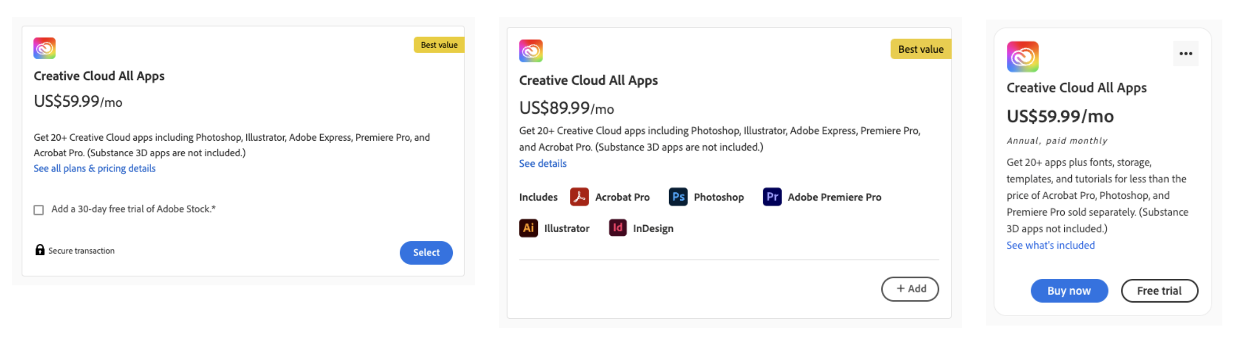
- Things that are the same look different. The same object, like a subscription, ends up designed inconsistently across screens because different people made different decisions about which attributes to surface, which components to use, and how to arrange them.
- Things that are different look the same. Semantically distinct objects end up visually indistinguishable because they’re all built from the same elements, like the generic card element.
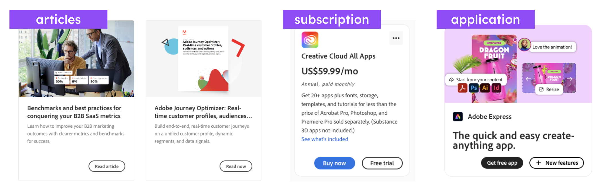
The root cause is that most design systems operate at the level of visual parts like tokens and components like buttons, cards, and modals. Missing is a layer that represents the objects in the product, the meaningful, contextual grouping of parts. The most critical context is what parts are most important in a given view of the object. This prioritization of attributes (represented by visual parts) dictates what parts show in which variants and their visual arrangement.
The solution in Rizzlet was to add an object layer. Rizzlet’s object layer is organized around the things Ringlet is actually made of: USER, PLAN, ACTIVITY, etc.
For each object, the process was:
- Define prioritized attributes: what does this object have, and in what order of importance?
- Map attributes to design system parts: which component or token represents each attribute?
- Design the card view: the object’s standard representation.
- Design at least one context: how does it appear in a list, a detail page, or nested inside another object?
A USER showing up as the host of a PLAN needs to surface different information than a USER in a friend search. The priority order is what determines what appears in a minicard (smallest representation) versus a full card or detail page.
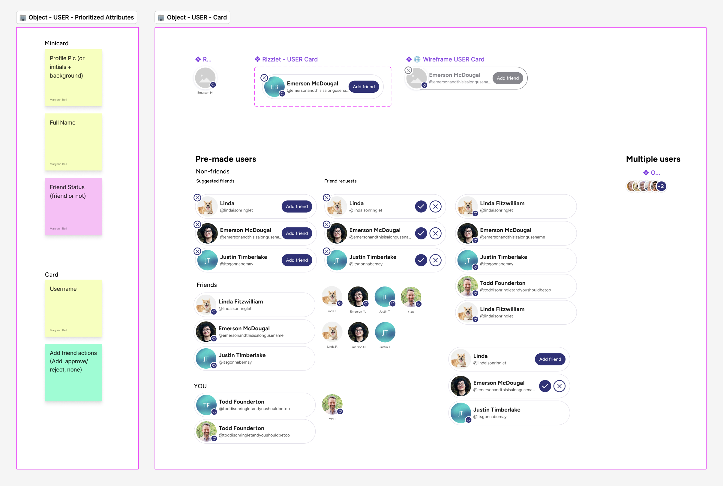
Each object page includes the designed components, ideally for every state and context. The prioritization reasoning is preserved alongside the designs, so when something needs to change, the original thinking is still available.
Implementation
I started with an audit of existing designs, pulling together common elements and finding where we’d already drifted: many shades of branding colors, inconsistent button sizes, spacing decisions that varied screen to screen.
The foundational layer of Rizzlet captures Styles & Building Blocks: colors, typography, forms, modals, navigation, icons, buttons, and profile components. Each element is a Figma style or component, making it reusable and consistent across files.
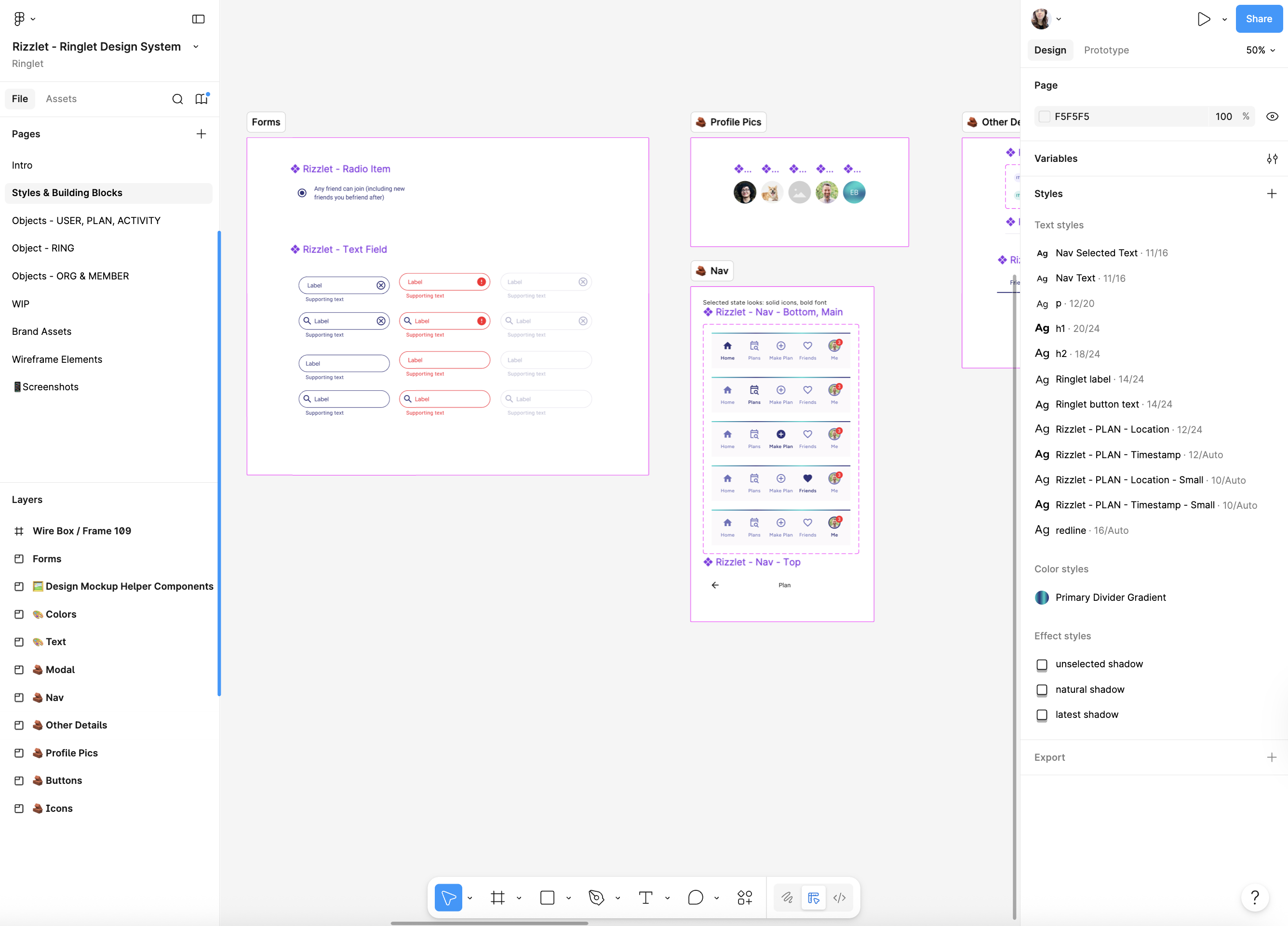
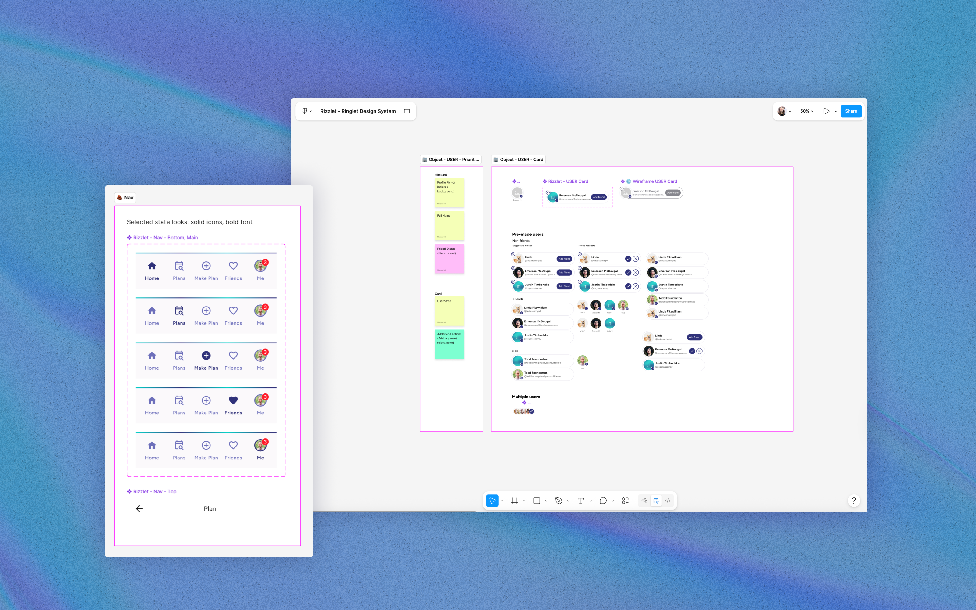
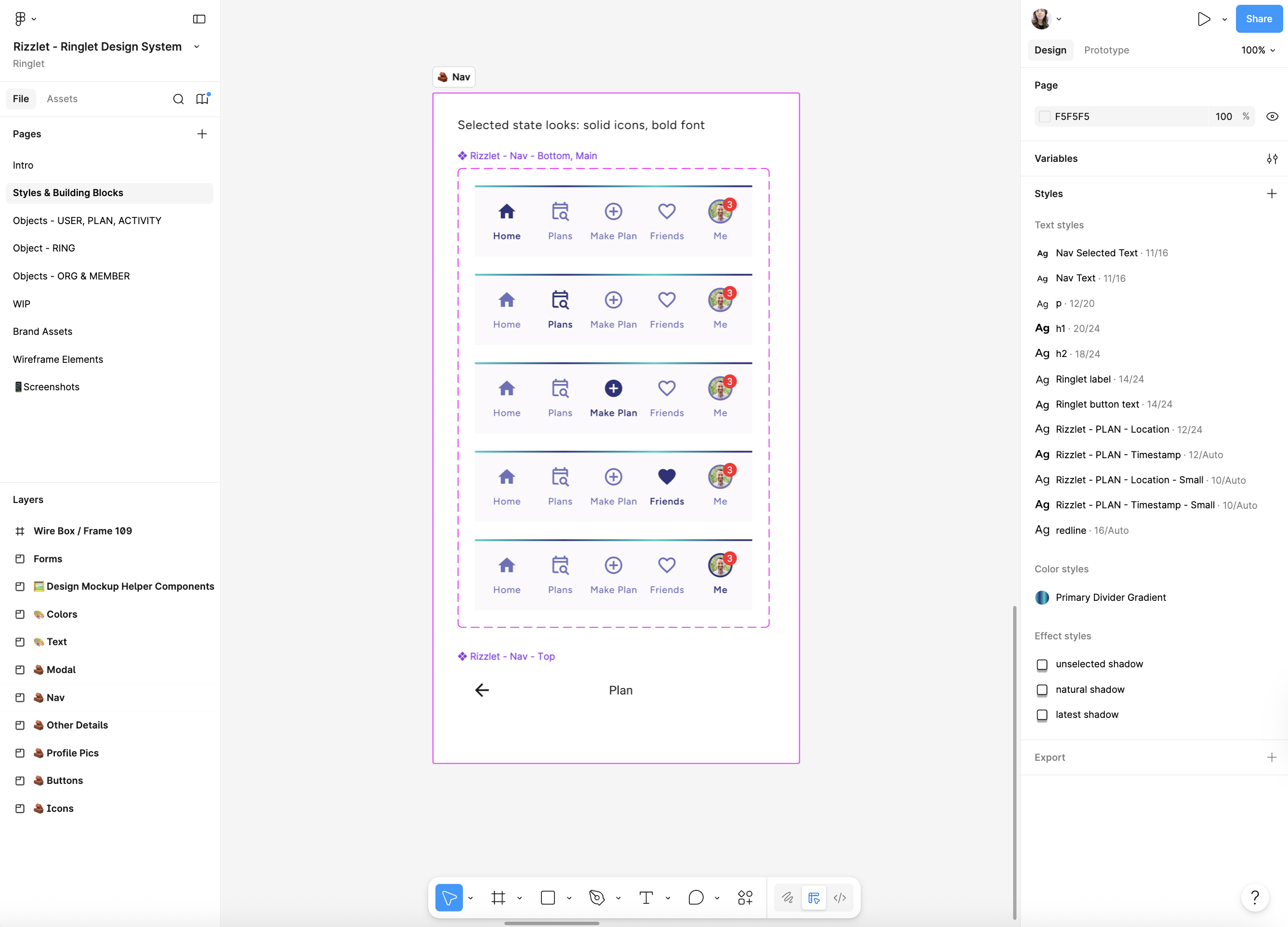
For example, the nav component documents every selection state.
Ringlet’s app is built using React Native Paper, a Material Design library. Rather than starting the Figma library from scratch, I started with the Material 3 Design Kit as a Figma foundation. Building components from scratch in Figma is time-consuming, and there’s almost always an existing artifact worth starting from. I used the Design Kit components and edited them to reflect Ringlet’s branded identity — spending our limited time on the problems unique to our product, not on ones already solved.
Wireframing (and abandoning it)
I originally included wireframing elements in Rizzlet, pulling from the Paper Wireframe Kit. In practice, once every object and building block was available, it was faster to use the real components than to wireframe first. Our process became: discuss the use case → sketch the workflow in low-fidelity tools like Lucidchart or Figjam → build directly with UI components. The wireframing step turned out to be unnecessary overhead.
Teaching the Team
After building the system, I did a “soft launch” by using the system myself for the next set of feature designs during the following sprint. After I was able to use it for new designs, I scheduled a Lunch & Learn for the founding team and took them through how to use it. They’re not Figma power-users but they’re all technically savvy and ambitious, so they were really excited to have a new toolset to pull from. In my experience, people love being able to create designs, even if it’s just to explain ideas visually.
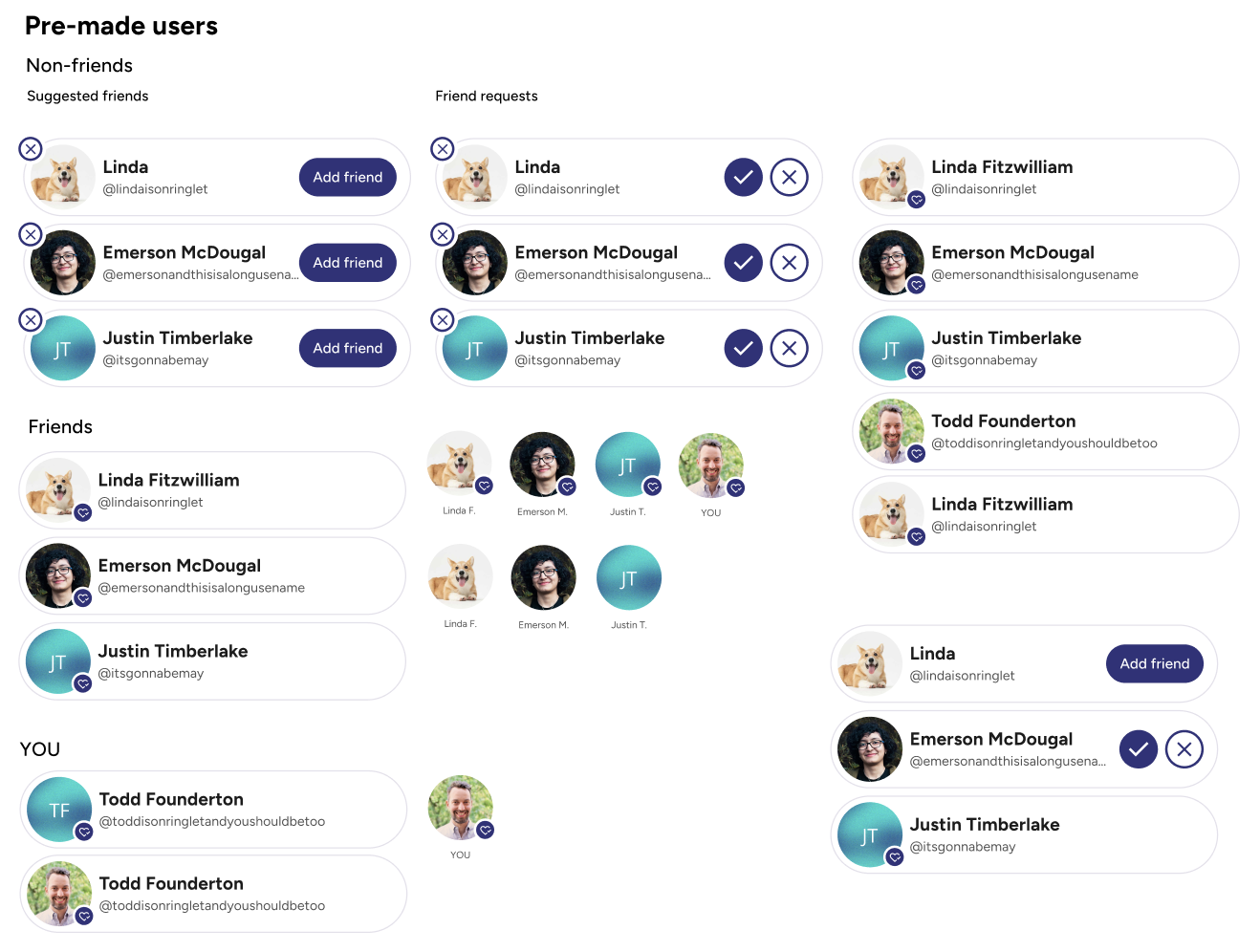
You may have noticed that the Rizzlet object page for USER above includes many pre-made instances. You see the USER card in every state, with different sample data already filled in. That was intentional. Rather than expecting the team to learn how to edit properties of Figma components and properly detach them from Figma to edit, I gave them ready-made examples they could copy, paste, and modify. This satisfied the core usability goal of the system.
Outcomes
The founding team has been using Rizzlet autonomously for years, with the only major updates being new objects necessary for new features. The work I do with them now is more conceptual: defining objects needed for features and helping to prioritize the visual parts.
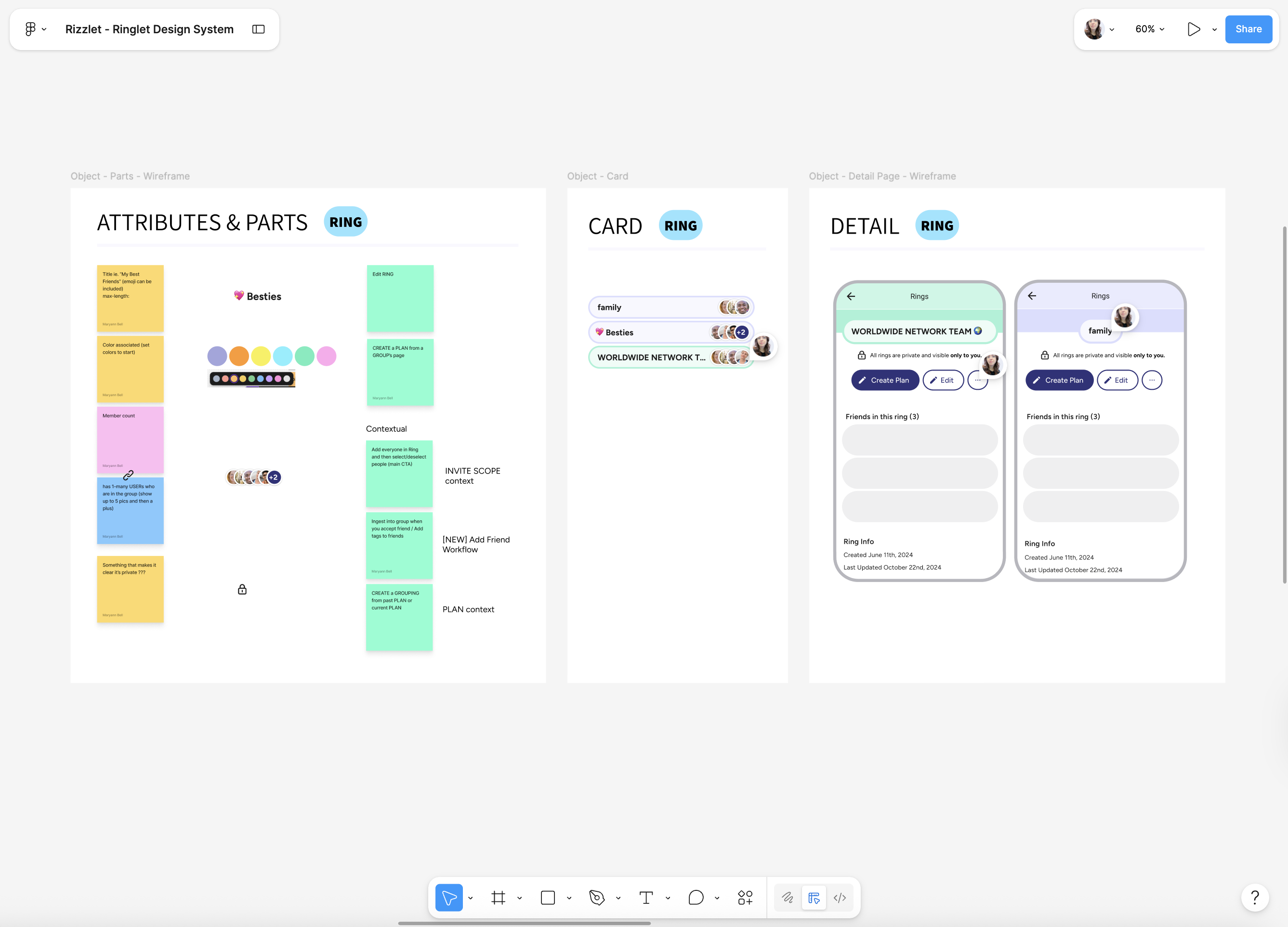
The RING feature is a good example of the system in action. The RING object was designed after MVP launch and after Rizzlet was created, so we started from the design system. We created a new page, defined a RING’s attributes, and built out its states and contexts using existing parts as building blocks.
Using Rizzlet with AI
An outcome that I didn’t anticipate is how helpful the design system is in the new AI landscape. The team now feeds Rizzlet into AI tools to generate new design concepts. Because the system captures not just the visual components but the underlying object structure, it also gives the AI meaningful design vocabulary to work from. The AI can even help generate new objects.
This has increased the speed of the team even more, and made the process even smoother. I am no longer a bottleneck and sometimes I update the app and see new features that I didn’t even know were happening. And they look great! It is so fun to see the team operate at this level without me, due in part to my work on creating the design system.