Ringlet MVP: Laser-Focused on Launch
Overview Ringlet's co-founders had a working prototype and a lot of innovative ideas. As Head of Design, I brought structure and ruthless prioritization to the fast-moving, resource-constrained team to create a focused MVP.
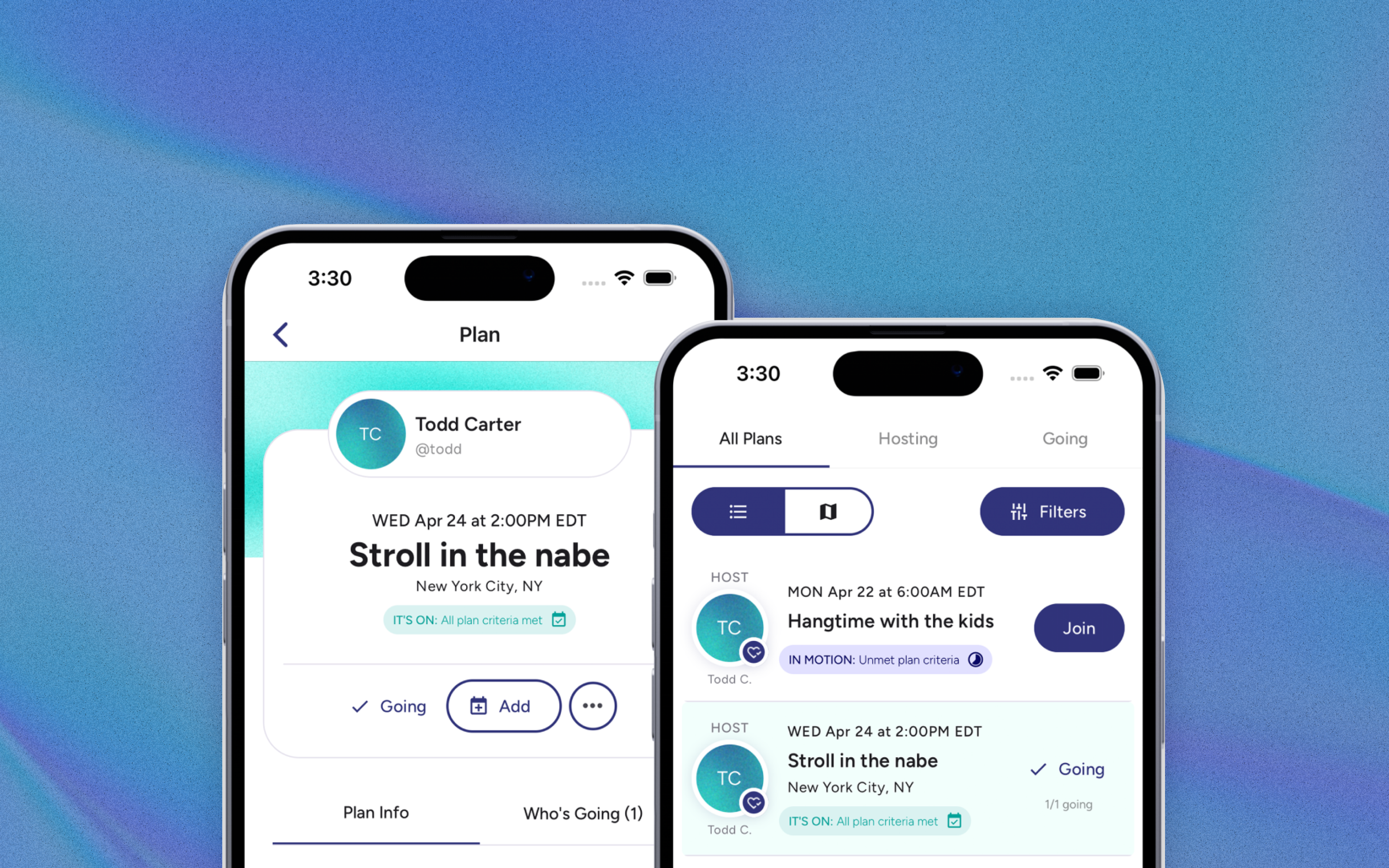
Impact Launched on both the App Store and Google Play in < 6 months with 200+ sign-ups in week one, positive UI/UX feedback from early users
Strategy
When I joined Ringlet, the founding team was clear on their mission: help people get together IRL. They also had a prototype, an aggressive timeline, and a lot of ideas, with a small, resource-constrained team and development already underway. My job was to bring clarity without slowing momentum.
I set three priorities:
- Explore and clarify: Assess all the ideas, identify the core differentiators, and align on what actually mattered for launch.
- Prioritize ruthlessly: Build a useful MVP while ensuring no innovative ideas were lost in the process.
- Move fast in parallel: Give UX guidance through quick, iterative deliverables so development could keep moving.
Process
I led the team through discovery, requirements alignment, prioritization, wireframing, and user testing. To structure this scope of work, I primarily used Object-Oriented UX (OOUX), a methodology I hold advanced certification in as an OOUX Strategist. OOUX focuses on defining the objects of a system and their relationships before jumping into flows. Humans think in objects (not actions or adjectives) so this approach creates interfaces that map to users’ mental models and ensures consistency across the UI.
Discovery & requirements
My first job was to explore and untangle. Through multiple facilitated sessions, I extracted the founders’ mental model of the problem space and reflected it back in a structured Object Map (Figure 1). This meant asking targeted questions about every object in the system: its relationships, possible actions, and core attributes.
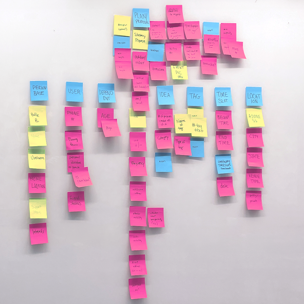
One early win was in shared vocabulary. The team kept using the word “invite”, but Ringlet’s primary interaction was fundamentally different. Users don’t send invitations, they make plans available for specific people to join. A small distinction with huge design implications. I flagged it and we aligned on new language (we chose PLAN as the object’s name), clearing up confusion and guiding the approach moving forward.
From there, I did a deep-dive on requirements for each object and built two deliverables:
- Object Guide: A Notion database capturing detailed requirements for every object (definitions, mechanics, permissions, competitive research). This became our single source of truth.
- Backlog: An exhaustive list of every feature, attribute, and CTA we discussed, organized by priority.
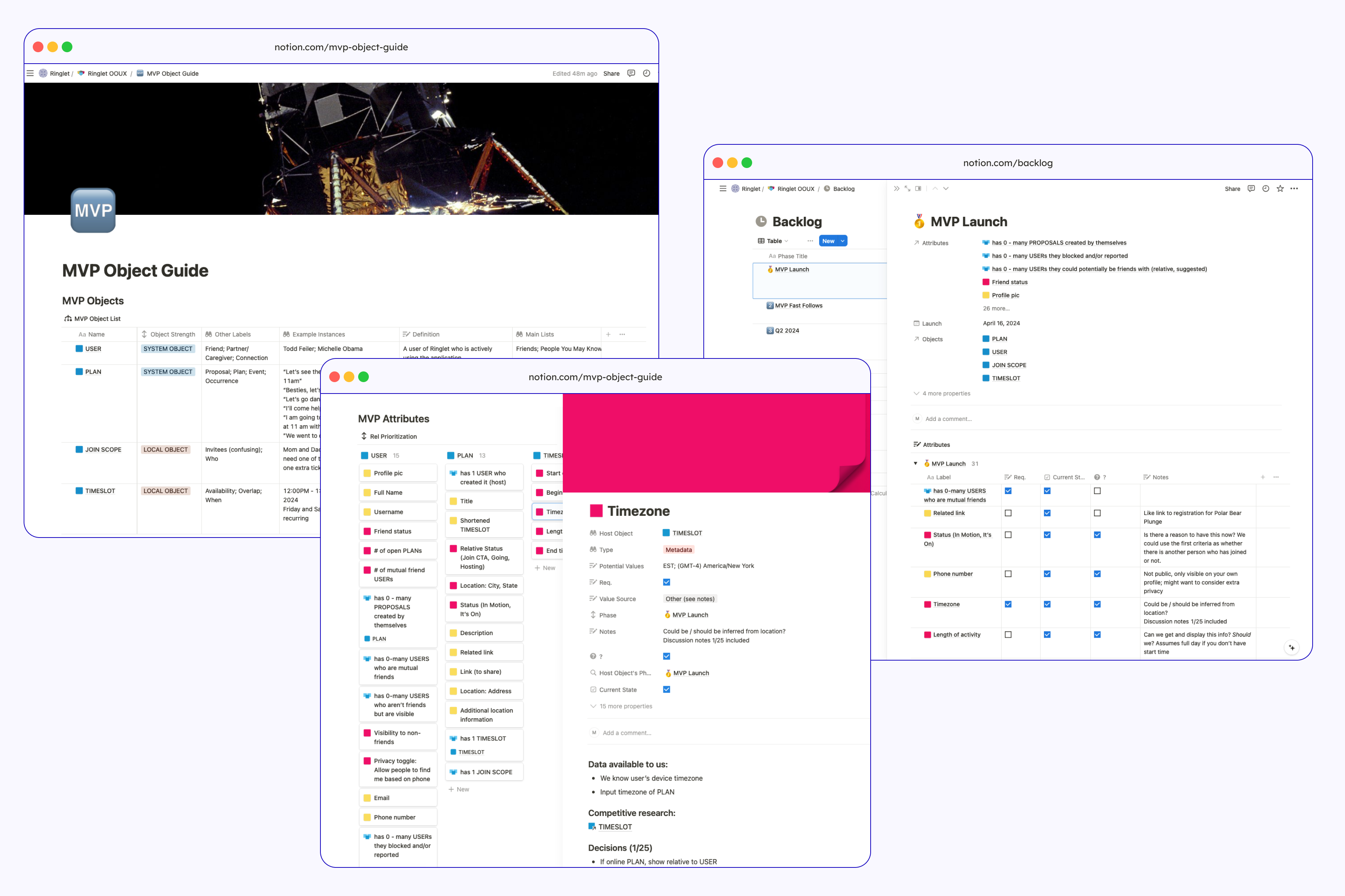
Having these conversations up front addressed complexity before it hit code, avoiding rework and scope creep. The Backlog also helped the co-founders to be confident that even if we deprioritized something for launch, it was still captured and planned for upcoming sprints.
Prioritization
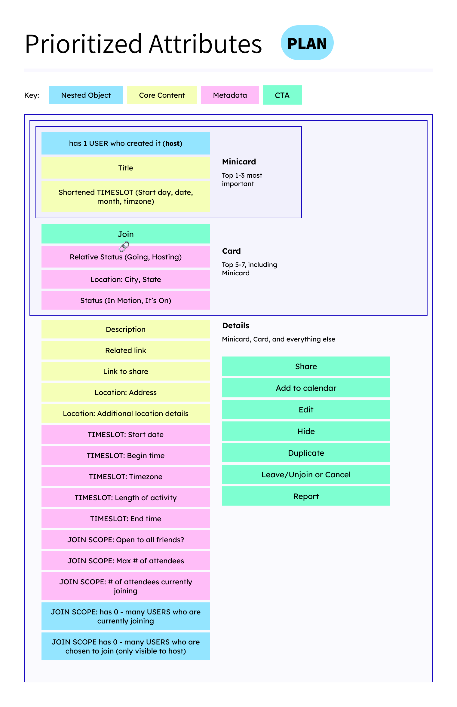
Once we had the full picture, I led the team through aggressive prioritization. What’s the leanest version of the app that’s still useful and differentiated?
We aligned on MVP scope by asking: Does this feature make Ringlet uniquely valuable, or can we add it later? I pushed back on good ideas that weren’t essential. The hardest part of this project wasn’t designing features — it was protecting the team from their own ambition.
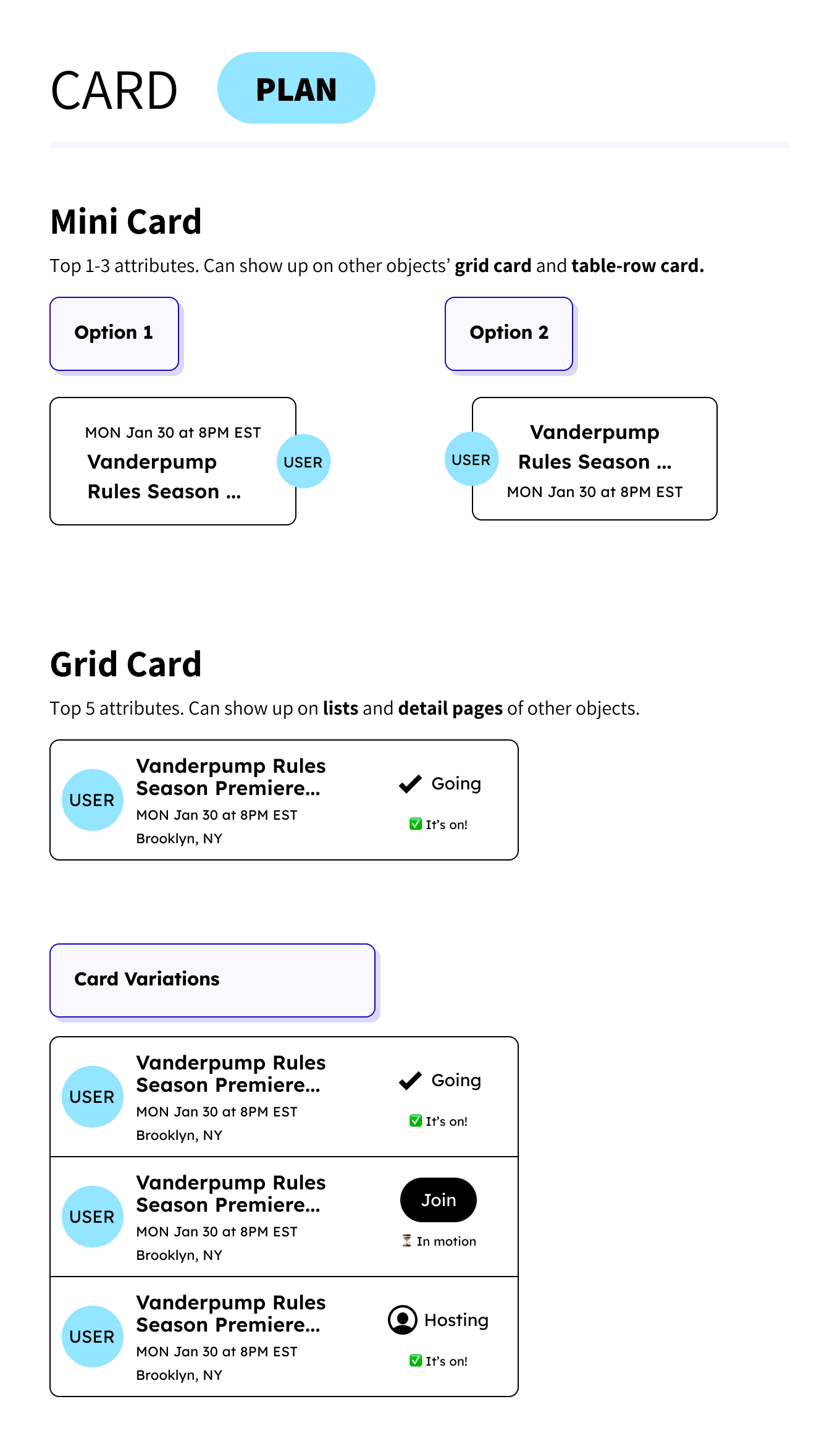
For every object, I worked with the team to rank attributes by importance. The most critical attributes appear in every view of the object; less critical info only shows in detail views. This kept the UI clean and focused. Attribute prioritization also guided feature decisions: if an attribute ranked low, it didn’t make the MVP.
Wireframing & user testing
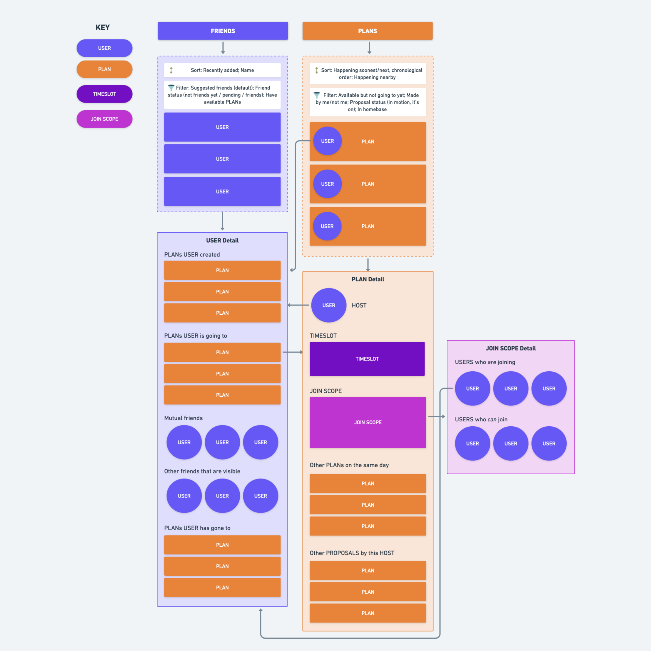
Once we’d pruned down to MVP essentials, I created wireframes and a Nav Flow (Figure 5) to visualize the app structure.
The existing prototype had a major usability issue: PLANs lived under a “Me” tab, which confused users. I redesigned the navigation to reflect the system’s object relationships, giving PLANs their own primary navigation item. This cleared up the confusion in subsequent user testing.
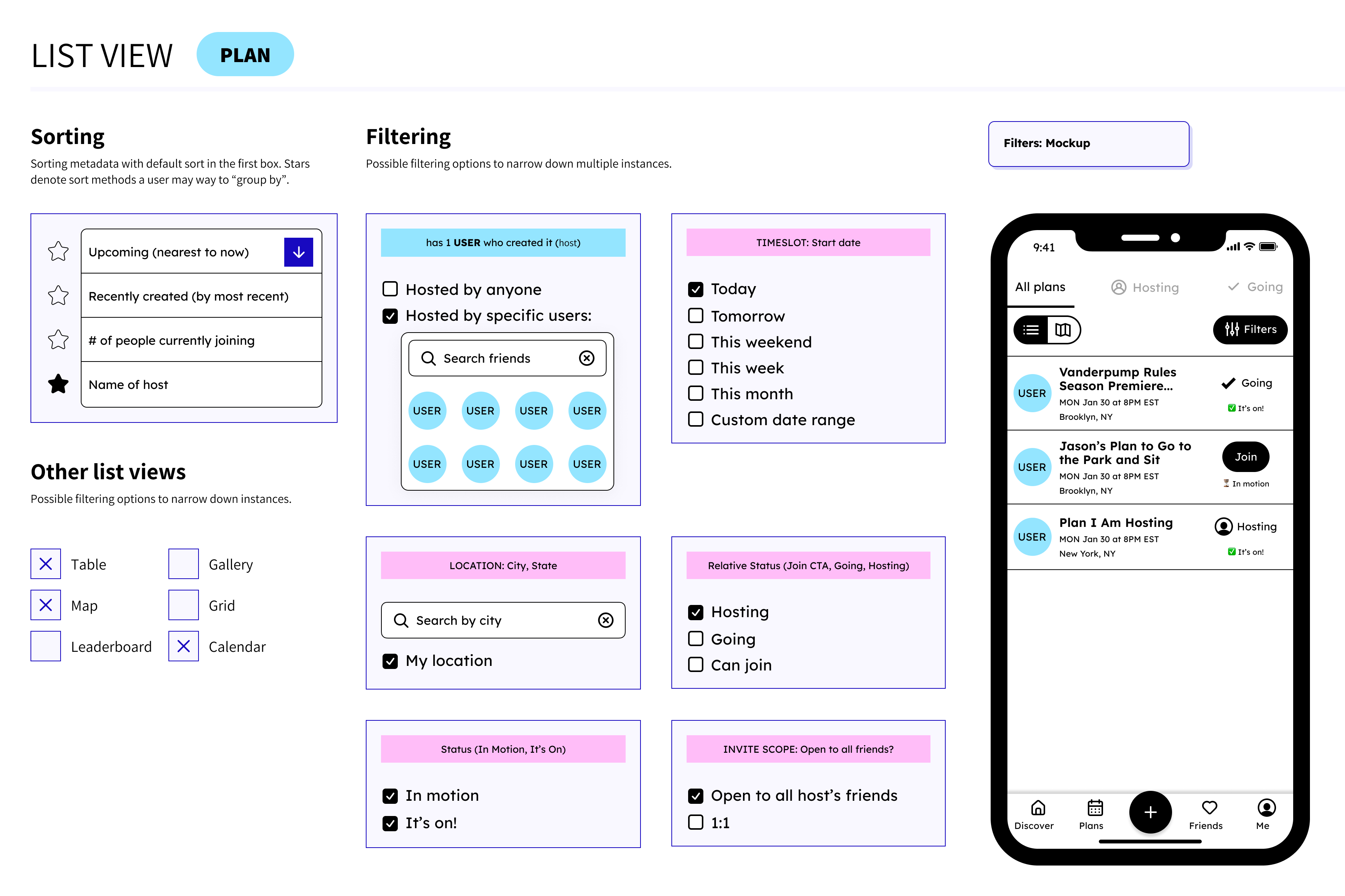
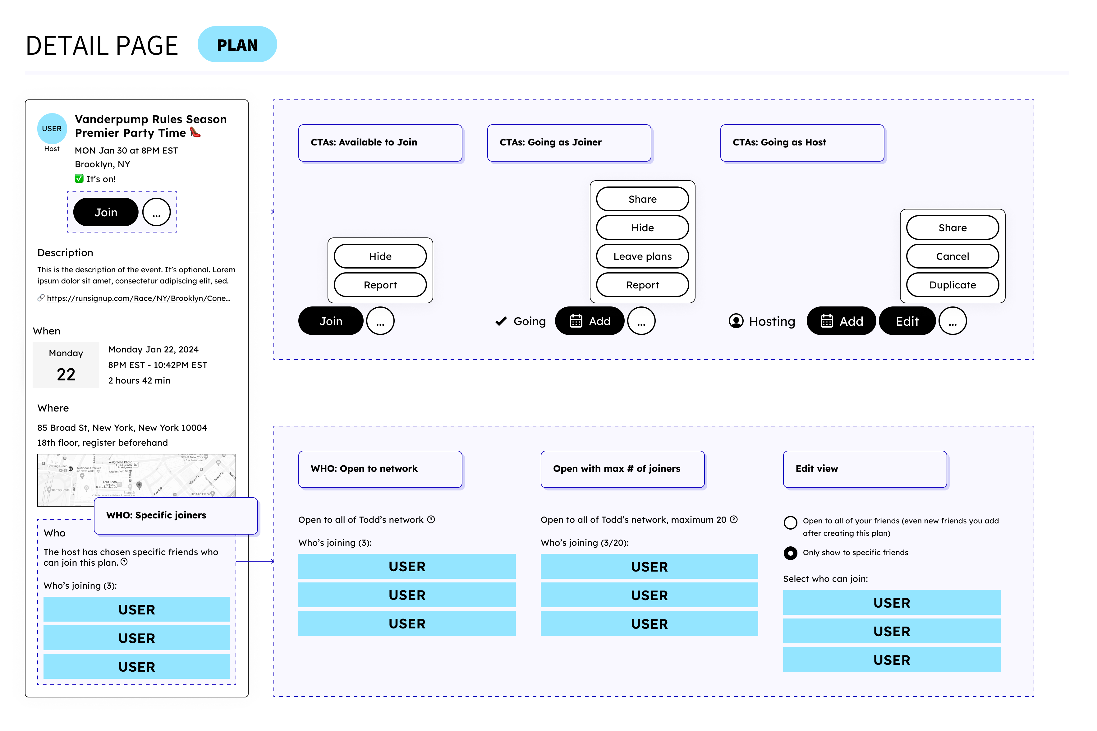
I then created wireframes for each primary object in multiple contexts: minicards, cards, detail views, and list views with sorting and filtering options (Figures 4-8).
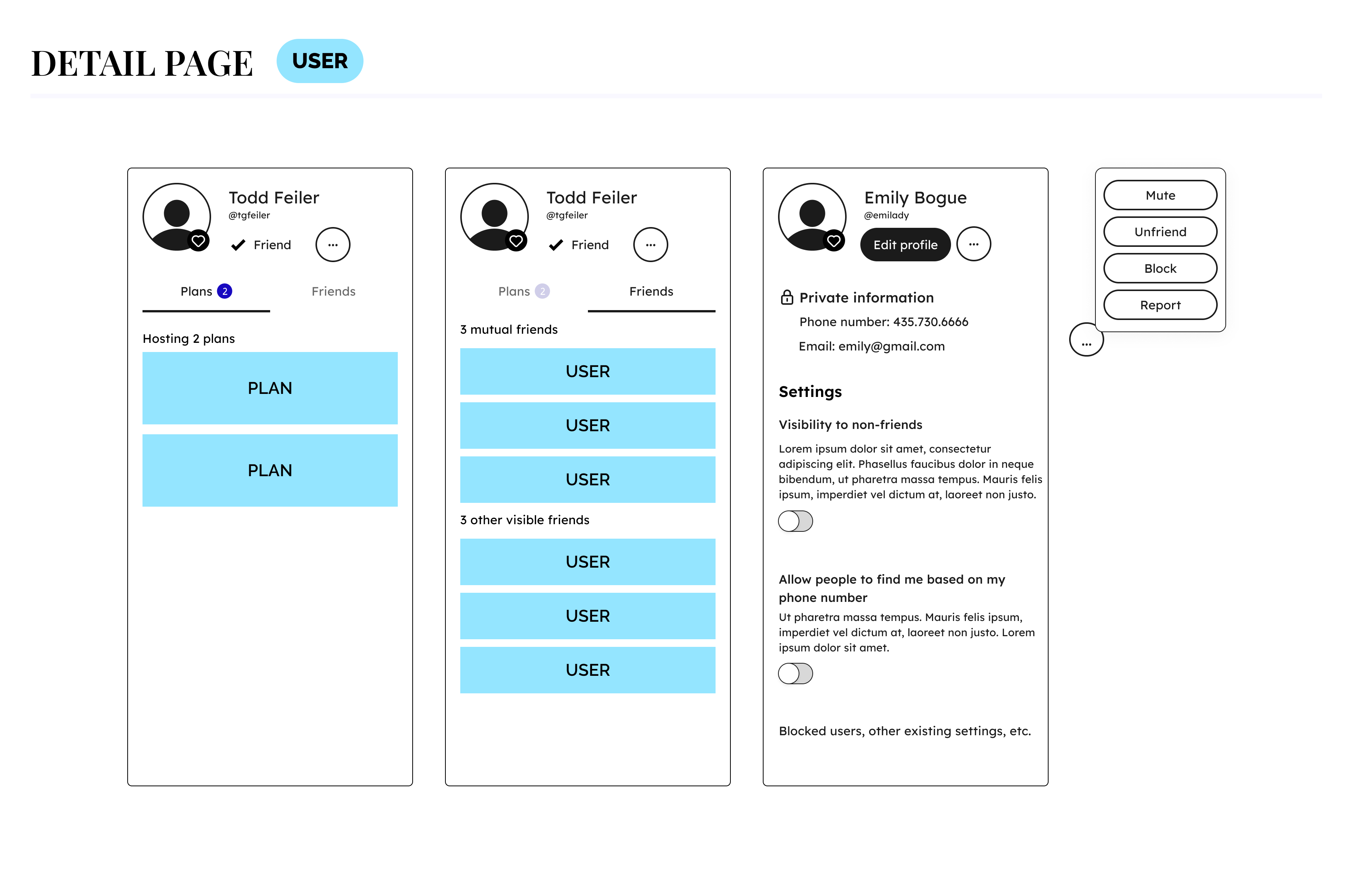
Throughout the requirements phase, I kept a running list of assumptions we needed to validate. By the time we got to user testing, we had a focused set of questions structured around ORCA: Were these the right objects with the right labels? Did the relationships feel intuitive? Were the CTAs clear? Did the attribute prioritization surface the right information?
Testing surfaced several concrete changes. Plan status wording was consistently confusing, so we iterated on how it was communicated. Users also wanted “who’s going” surfaced higher on the Plan detail view — a quick win for at-a-glance clarity. And one question about cost revealed a deeper misalignment: some users expected expense-sharing features, while Ringlet’s vision was specifically about intimate hangouts. That signal helped sharpen the product positioning before launch.
Outcomes
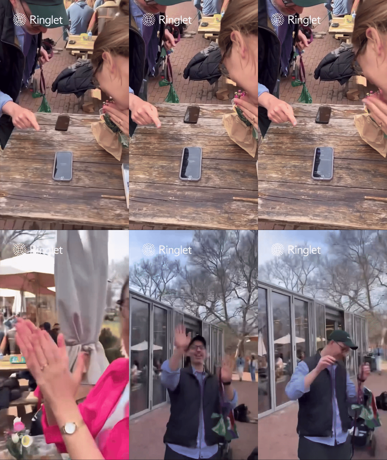
Ringlet launched on April 16, 2024: on time, in scope, with 200+ sign-ups in the first week and strong UI/UX feedback from users! The process I led gave the team a shared language, a clear prioritized roadmap, and a cohesive vision for the product UI. The object-based structure also proved its value post-launch: when the team tackled flexible time as the next major feature, the work moved faster because the Plan object’s structure and metadata were already well-defined.
What made this project work wasn’t any single deliverable; it was the upfront investment in clarity. By the time we were building, the team was aligned on what Ringlet was, what it wasn’t, and why. That foundation made every downstream decision faster and more confident. For a small, resource-constrained team racing toward launch, that shared understanding was the most valuable thing I could provide.